Blog
Make Yourself at UWTSD: how insight became identity, and a campaign found its voice
5 min read Written by: Emma Northcote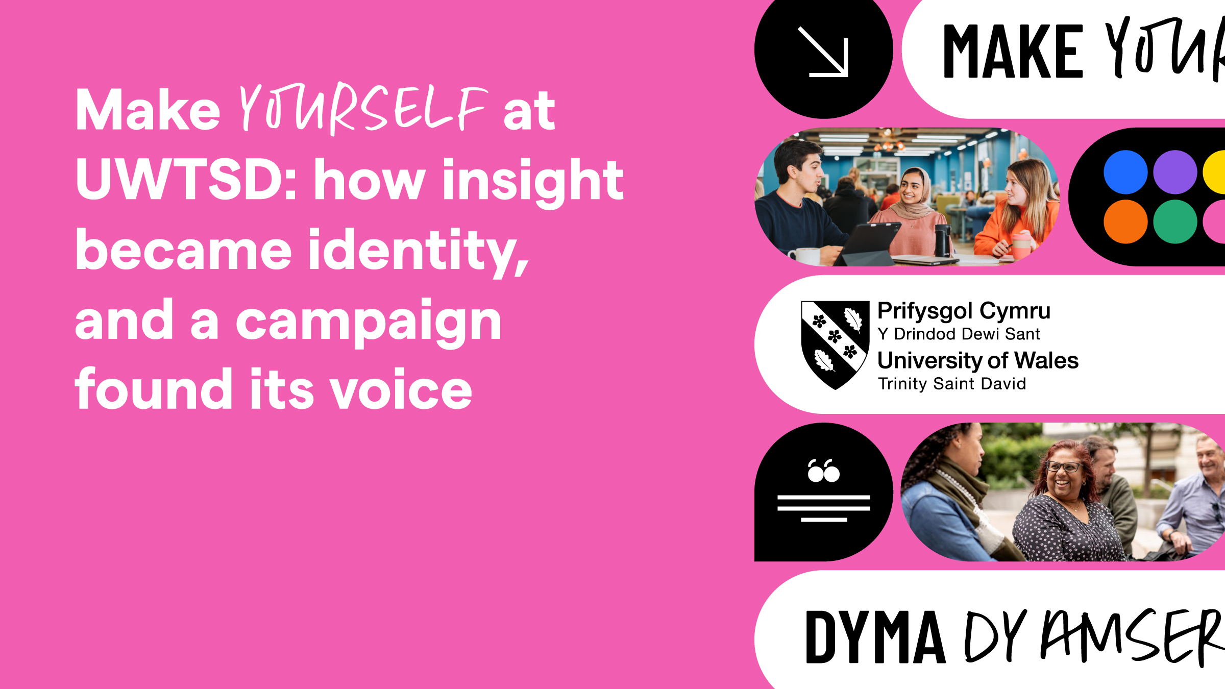
In spring 2025, Perago was selected to support the University of Wales Trinity Saint David in developing its undergraduate recruitment campaign for the 2027 intake. In our three-part deep dive into the campaign, we’ve already looked at how insight and pride in place shaped our thinking. This blog by Perago’s Liam Beattie – who was the Creative Lead on this project – covers how that insight became the campaign’s identity.
Six weeks of research. Hundreds of conversations. A lot of coffee. Out of all of it, two moments really stuck with me. The first was when a parent made it clear that this wasn’t their child’s decision to make alone; it was a family one, and the parent was practically a co-pilot in it. The second was at an open day, when a student ambassador mentioned that he’d come all the way from Mexico to study motorsport engineering here. Not for the city, not for the campus. But for one specific lecturer in that field, and the fact that graduates from the course had gone straight into F1. That’s not a vague aspiration. That’s a clear route from lecture theatre to pit lane.
Moments like that don’t show up neatly in a slide deck. As a designer, you can easily end up working from the brand guidelines or the brief alone. This work was rooted in real conversations and genuine market insight instead. This is the middle of that story: how we turned moments like these into a campaign that opened the doors on the real UWTSD.
From findings to drivers
Research is only useful if you’re honest about what it’s telling you. In this case, it was telling us something clear: students weren’t looking for a university that promised them the world. They were looking for one that recognised them for who they are.
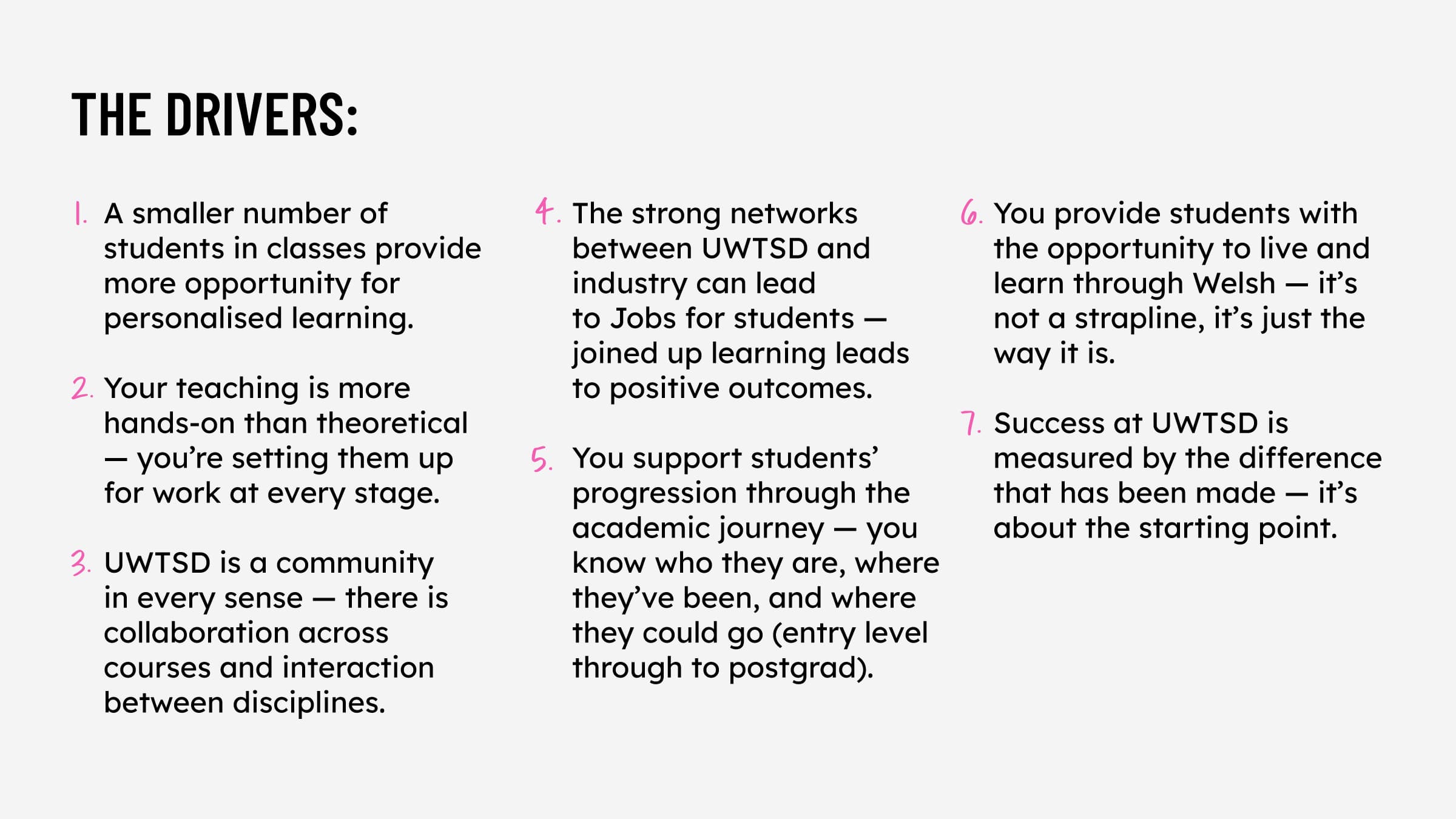
That shaped the first creative driver: recognition. Not vague aspiration, but the sense that you’re not a number, not a seat in a lecture hall. You’re a person with a name and a story that the institution actually cares about.
Closely connected to that, UWTSD’s offer was already strong: smaller classes, hands-on teaching, genuine industry connections. We heard this consistently and it was well known-internally with the research telling us it was the thing prospective students responded to most strongly, once they heard it plainly. The job wasn’t to reinvent the university – it was to say the true thing, really shout about the key strength loudly and without apology, and in a crowded recruitment market, that kind of clarity is rarer than you’d think.
There was something else too – something the numbers alone couldn’t quite capture, but the conversations could: the pride people felt in having studied at UWTSD. Not pride despite choosing a smaller university, but because of it. That distinction mattered. It meant the campaign couldn’t be passive or deferential – it had to own the space.
Finding the line
The campaign thought that emerged from those drivers was deceptively simple: Make Yourself.
On the surface, it reads as a call to action: come here, build something, become who you’re meant to be. But the more you sit with it, the more it does. It positions the student, not the institution, at the centre of the story. And crucially, it’s not just aspirational wallpaper. It’s backed by something real: a university that measures success by where you started, not just where you finished; that connects you to industry from day one, not as an afterthought at graduation; and that knows where you came in and where you could go, from foundation level right through to postgrad. The line holds enough space to mean a hundred different things to a hundred different people, because at UWTSD, it genuinely does.
The Welsh version, Dyma dy amser di, translates roughly as ‘This is your time’. But it’s its own thought, not a translation. Where the English is active and expansive, the Welsh is intimate and direct. Both expressions share the same belief, but they earn it differently.
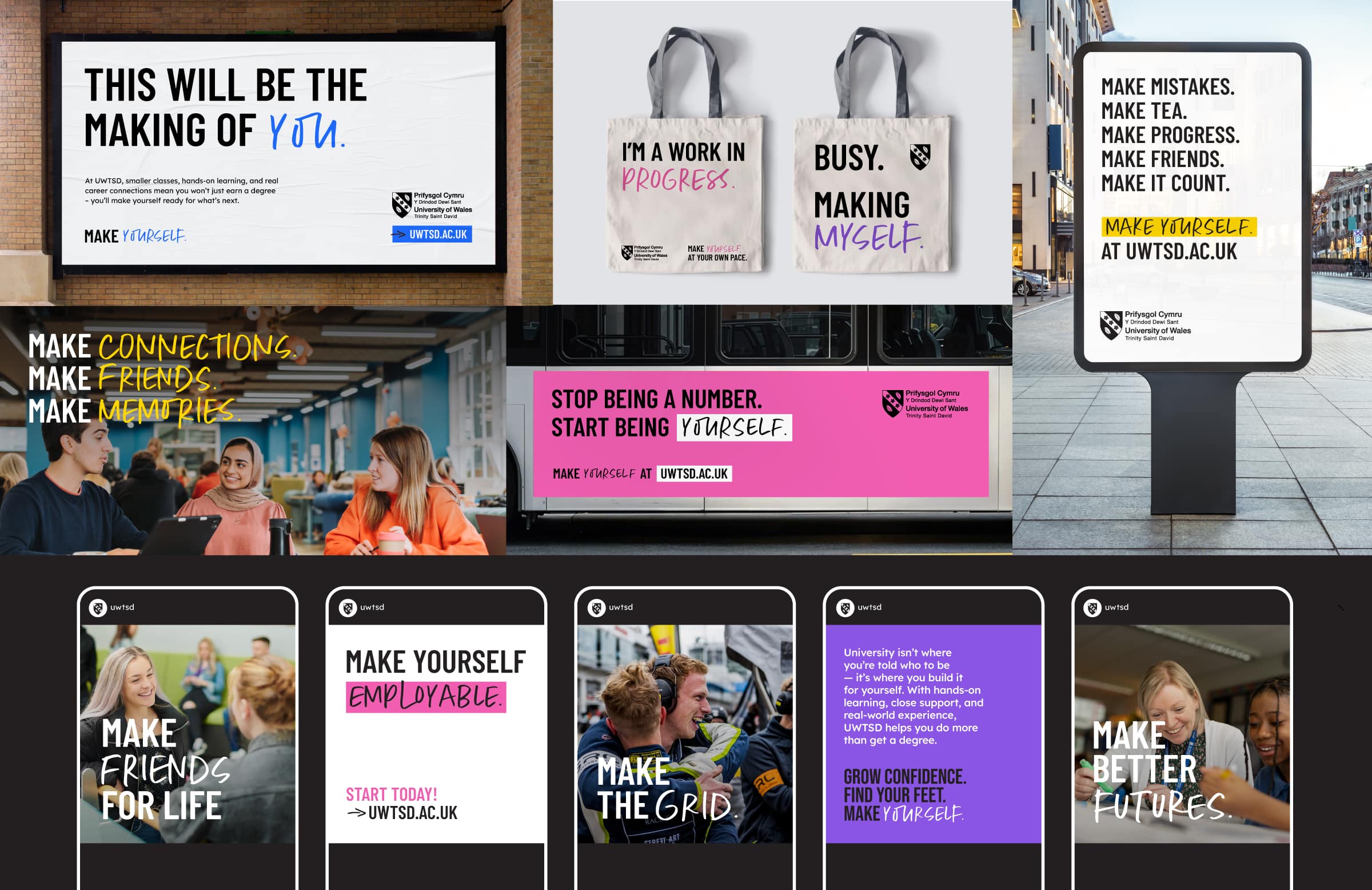
The sub-messaging that grew from the central line was built to flex. At full stretch, on billboards and bus sides, the language is playful, punchy, and willing to pick a fight with the conventions of higher education marketing – Stop being a number. Start being yourself. Not sure you belong? Perfect place to start. Pulled back for course-specific or audience-targeted communications, the same voice stays consistent but quieter, more direct. Studying later in life takes guts. We’ll match it with support. Same campaign, different register – but always with the same conviction.
Building a system that could scale
A campaign line is nothing without a system behind it. And a system is nothing if it only works in one place.
The design system for ‘Make Yourself’ was built around one principle: it had to be able to go anywhere – OOH, social, digital, print, environmental – and feel like itself at every scale. That meant making decisions about typography, colour, and layout that were grounded in more than aesthetics.
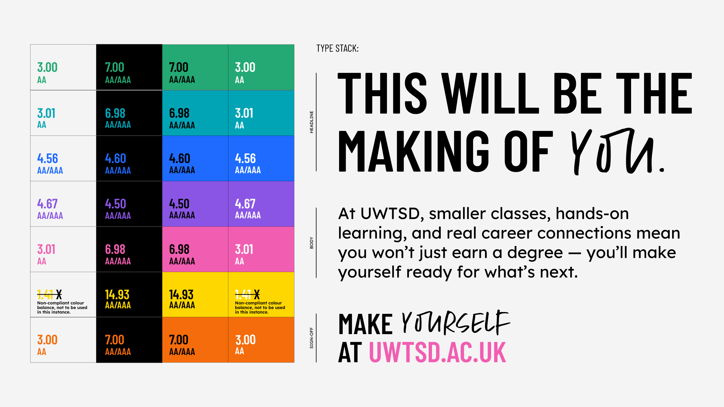
The typographic approach pairs three typefaces: Barlow Condensed, Lexend, and the handwritten Margot Marker. Barlow Condensed keeps headlines compact, which matters in a bilingual campaign where Welsh translations often run longer than their English equivalents. Lexend carries the body copy – it’s designed to be easier to read, with real benefits for people with dyslexia. Margot, used sparingly and always in capital letters, brings a handcrafted quality to headlines: the sense that something has been written, not just set. Together, they give the campaign a voice that’s bold, human and easy to read, wherever it shows up.
The colour palette follows the same thinking. Seven campaign colours – green, turquoise, blue, purple, pink, yellow, and orange – sit alongside black and white, each with a full range of tones to keep the system flexible. Every colour combination used for text was checked against WCAG guidelines, the industry standard for accessible contrast, to make sure it’s genuinely readable, including for people with visual impairments. Yellow on white, for instance, didn’t make the cut, so it’s simply not used that way. These aren’t just design decisions. They’re a commitment to reaching everyone in the audience.
Welsh as emotion, not translation
This is probably the thing we’re most proud of, and the thing we most want to make clear.
When we presented to UWTSD’s senior leadership team, their enthusiasm for pushing the Welsh campaign beyond translation was genuinely energising. They steadfastly believed in and were passionate advocates of the Welsh language being authentic and a central feature in how UWTSD is portrayed both in the campaign and in their wider approach, That commitment from the top gave the Welsh Language team the platform and the confidence to do something really special.
The Welsh campaign found its own voice through a genuinely collaborative process. The English creative came first, and as the university’s Welsh Language team worked through it, it became clear that the Welsh needed to do something different – not mirror the English, but find its own way of saying it. With specialist support brought in alongside the team’s own expertise, what emerged was a Welsh campaign that stood on its own terms. Without that collaboration, the campaign would have had bilingual assets. With it, it had two campaigns that both meant something.
That process revealed something important: the most powerful Welsh executions in the campaign aren’t the ones that say the same thing as the English. They’re the ones that find the Welsh way of saying it. Dyma dy amser di isn’t ‘Make yourself’ in Welsh. It’s something more tender and certain at the same time. Ti’n fwy na rhif means ‘you are more than a number’, and it carries a weight and directness in Welsh that changes slightly in translation. Bydd yn ti dy hun, ‘be yourself’, has a rhythm in Welsh that just feels right in a way that’s hard to explain but immediately felt.
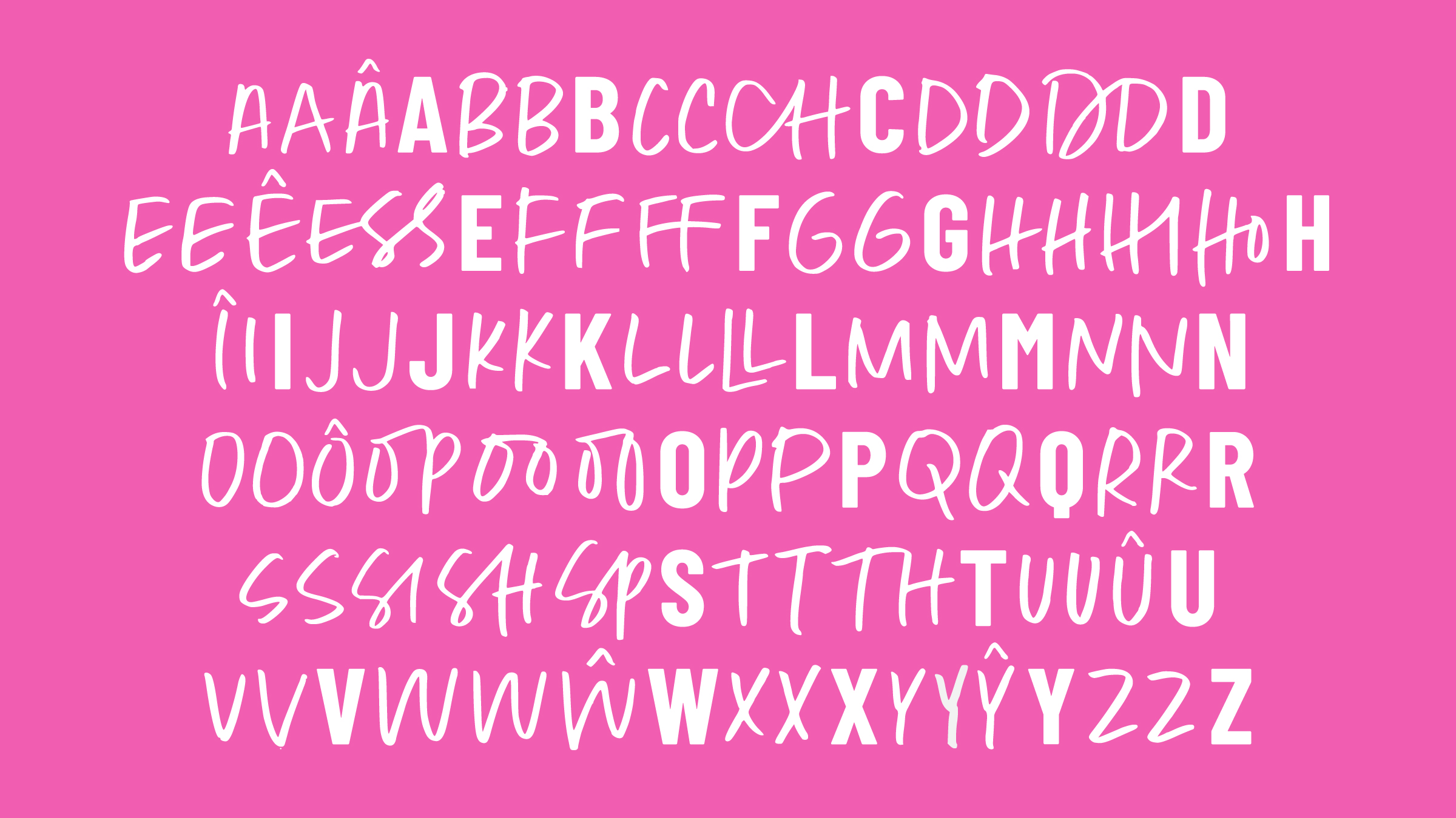
We also extended the Margot Marker handwritten typeface to handle the accented characters Welsh requires: the circumflex, diacriticals, and unique letterforms that distinguish written Welsh. The handwritten elements in Welsh executions feel crafted, not patched together. Because they are.
The result of working this way goes beyond the campaign assets themselves. Ensuring that the way in which the campaign lands in Welsh is far more than direct translation.
Consistency across every channel
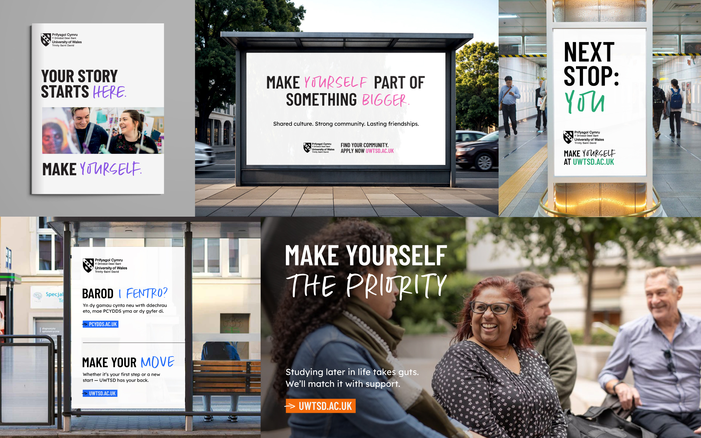
The system was designed to hold its shape from a 96-sheet billboard to a phone screen. Campaign-led messaging, community and culture messaging, course-specific messaging, student story-led messaging. Each strand has its own register and purpose, but all of them live inside the same visual and verbal world.
The messaging hierarchy works across formats without losing energy at either end. OOH executions lean into the playful, provocative side of the campaign: headlines that stop people rather than whisper at them. Social templates carry the same type-led approach into smaller formats, with colour used as a signal rather than decoration. The exhibition stand built for UCAS fairs turns the typographic system into an environment. Walking into the stand, you’re inside the campaign.
That kind of consistency isn’t accidental. It’s a design system doing its job.
What comes next
The campaign also laid the groundwork for its natural evolution: Made at UWTSD. Where ‘Make Yourself’ speaks to prospective students at the start of their journey, ‘Made at UWTSD’ speaks to graduates who’ve completed it. The shift from making to made, from aspiration to achievement, is its own campaign platform, already waiting for its next chapter.
Not many campaigns arrive with their sequel already written. But when the work is rooted in something true, in real feeling, real need, real ambition, the next chapter tends to suggest itself. That’s what happens when you start from the right place.
Good campaigns tell the truth. Great ones give people the language to tell it themselves. This one, we think, does both.
Latest from the blog
Caerphilly’s £13.5m savings mark one year on from Perago-backed transformation programme
3 min read
Lantela’s diagnostic workshops: how do they work, and how to take part
3 min read
Sport Wales appoints Perago to lead service mapping project
5 min read
Launching Lantela: making sustainability work in practice
5 min read